

Ezequiel Lavezzi - Napoli
+3
Fowlisss
StevieG895
TheMightyDobbo
7 posters
Page 1 of 1

Ezequiel Lavezzi - Napoli
![]() by TheMightyDobbo Thu 19 Jul 2012, 01:46
by TheMightyDobbo Thu 19 Jul 2012, 01:46
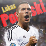
4 versions, comment on which is best and what needs to be improved 
[You must be registered and logged in to see this image.]
[You must be registered and logged in to see this image.]

TheMightyDobbo- Getting used to this

- Posts : 56
Points : 450171
Reputation : 2
Join date : 2012-07-17
Location : Leeds
Re: Ezequiel Lavezzi - Napoli
![]() by StevieG895 Thu 19 Jul 2012, 01:48
by StevieG895 Thu 19 Jul 2012, 01:48
#2 for me, colour is better and im not really into the text.. if you reduced the height a bit and but a better text, it would be great 

StevieG895- Getting used to this
- Posts : 51
Points : 443287
Reputation : 17
Join date : 2012-07-17
Age : 29
Location : Sweden
Re: Ezequiel Lavezzi - Napoli
![]() by Fowlisss Thu 19 Jul 2012, 01:51
by Fowlisss Thu 19 Jul 2012, 01:51
v4 is by far the best for me, text was bad on the previous, but perhaps try to size it down? them dimensions are a bit... peculiar?
v2 is also a nice colour scheme, they're very similar but different colours it seems, so either of them!
Other than that, it's a solid sig, blended nicely
Although I don't really like how visible the face is behind him, try lowering opacity or even changing the direction it's facing on the other side
Also the face really stands out, but because that's the only part of the sig in normal colour, i'd try lowering saturation on that or including it in the gradient map
Keep working!

Fowlisss- Admin

- Posts : 119
Points : 545354
Reputation : 18
Join date : 2012-07-15
Location : Liverpool -

Re: Ezequiel Lavezzi - Napoli
![]() by TheMightyDobbo Thu 19 Jul 2012, 02:07
by TheMightyDobbo Thu 19 Jul 2012, 02:07
Fowlisss wrote:
Also the face really stands out, but because that's the only part of the sig in normal colour, i'd try lowering saturation on that or including it in the gradient map
Keep working!
my aim for this was to highlight the red areas in his skin tone and to do that i thought this would be the best way to show it working, i'm resizing it atm as well
TheMightyDobbo- Getting used to this
- Posts : 56
Points : 450171
Reputation : 2
Join date : 2012-07-17
Location : Leeds
Re: Ezequiel Lavezzi - Napoli
![]() by TheMightyDobbo Thu 19 Jul 2012, 02:49
by TheMightyDobbo Thu 19 Jul 2012, 02:49
[You must be registered and logged in to see this image.]
TheMightyDobbo- Getting used to this
- Posts : 56
Points : 450171
Reputation : 2
Join date : 2012-07-17
Location : Leeds
Re: Ezequiel Lavezzi - Napoli
![]() by FB Slothmeister Thu 19 Jul 2012, 03:01
by FB Slothmeister Thu 19 Jul 2012, 03:01
Love v2 although the face is abit to bright, maybe take it down abit.
Also he seems to be in the wrong kit haha
haha
EDIT: Just seen your new one, must improved and i really like the text, the Lavezzi font is really nice, which one is it?
Also he seems to be in the wrong kit
EDIT: Just seen your new one, must improved and i really like the text, the Lavezzi font is really nice, which one is it?
FB Slothmeister- Getting used to this
- Posts : 66
Points : 448675
Reputation : 10
Join date : 2012-07-18
Location : Uk
Re: Ezequiel Lavezzi - Napoli
![]() by d0nkd0nk Thu 19 Jul 2012, 03:05
by d0nkd0nk Thu 19 Jul 2012, 03:05
The latest one is very nice. Great blending. The text is too plain imo, maybe add a clipping mask.

d0nkd0nk- Moderator

- Posts : 38
Points : 445770
Reputation : 19
Join date : 2012-07-17
Location : Florida
Re: Ezequiel Lavezzi - Napoli
![]() by TheMightyDobbo Thu 19 Jul 2012, 05:53
by TheMightyDobbo Thu 19 Jul 2012, 05:53
i was thinking of putting a clipping mask on as well.
changed the top text as well
[You must be registered and logged in to see this image.]
@Slothmeister the text is Tw Cen MT Condensed Extra Bold. Standard text in photoshop.
changed the top text as well
[You must be registered and logged in to see this image.]
@Slothmeister the text is Tw Cen MT Condensed Extra Bold. Standard text in photoshop.
TheMightyDobbo- Getting used to this
- Posts : 56
Points : 450171
Reputation : 2
Join date : 2012-07-17
Location : Leeds
Re: Ezequiel Lavezzi - Napoli
![]() by Gamerking17 Thu 19 Jul 2012, 07:12
by Gamerking17 Thu 19 Jul 2012, 07:12
I love that versionTheMightyDobbo wrote:i was thinking of putting a clipping mask on as well.
changed the top text as well
[You must be registered and logged in to see this image.]
@Slothmeister the text is Tw Cen MT Condensed Extra Bold. Standard text in photoshop.
Text is very nice, fits in well with the sig. Great blending and a nice background

Gamerking17- Moderator
- Posts : 39
Points : 441215
Reputation : 6
Join date : 2012-07-15
Re: Ezequiel Lavezzi - Napoli
![]() by TheMightyDobbo Mon 23 Jul 2012, 12:14
by TheMightyDobbo Mon 23 Jul 2012, 12:14
stopped his face from being red
[You must be registered and logged in to see this image.]
[You must be registered and logged in to see this image.]
TheMightyDobbo- Getting used to this
- Posts : 56
Points : 450171
Reputation : 2
Join date : 2012-07-17
Location : Leeds
Re: Ezequiel Lavezzi - Napoli
![]() by Besiktas Wed 08 Aug 2012, 04:29
by Besiktas Wed 08 Aug 2012, 04:29
TheMightyDobbo wrote:stopped his face from being red
[You must be registered and logged in to see this image.]
Amazing sig! improoved a lot from the first versions
Besiktas- Getting used to this
- Posts : 100
Points : 450424
Reputation : 0
Join date : 2012-08-07
Page 1 of 1
Permissions in this forum:
You cannot reply to topics in this forum|
|
|